What is meant by the term J curve?
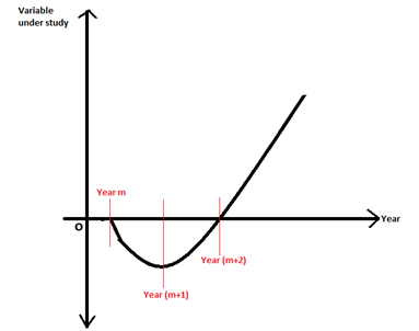
A J curve is a form of chart wherein a variable shows a falling trend initially, hit the lowest, and then begins to increase and shoots beyond the point from where it began to decline. The figure below indicates the j curve-shaped movement of a variable. The variable has a negative value between Year m and Year (m+1), and beyond Year (m+1), it starts to increase.
J Curve diagram for a variable change year on Year

Copyright © 2021 Kalkine Media
Summary
- J curve is a graphical representation to study the behaviour of a variable over a period of time.
- J curve demonstrates how over a period of time, a variable first worsens and then begins to improve.
- The point from where the trend line starts there is an improvement over the period under consideration.
Frequently Asked Questions (FAQs)
J curve in business
After a period of continued downfalls, a steep upward movement shows the J curve pattern. For instance, Instagram that we know of today was not off to a good start. It was launched as a mobile application named Burbn. However, the application failed because it was heavy to run on mobile phones. But the market research observations showed the preferences and strong liking that people had toward uploading pictures and selfies. With this insight, it was re-launched as Instagram and became what it is today. This is a J curve growth for the business.
For example, initially, YouTube was created as a video dating website. The founders expected it to be a medium where people would upload videos of themselves talking about their dream partner. However, nobody came forward, and the plan did not work. The founders then revamped the idea and opened it up to any video, and the rest is history. Within six months, there were more than two million users on the website per day, and there were over thousands of uploads daily. In 2006. Google acquired YouTube for $1.65 billion.
J curve in private equity
J curve in private equity is a graphical representation of the returns of a private equity fund over a period of time. The early life of a private equity commitment shows a downward trend. These early times are also referred to as the investment period- during this time, the investment manager attempts to source companies to acquire for the fund. Once this is done, the effort is to add value to the acquired businesses by putting into action the business plans that would later impact valuations. In the mid-period and later, the manager will mark up its portfolio investments as the business plan bear fruit; thus, the Internal Rate of Return begins to grow, and the investment becomes profitable.
Investors can get higher returns from private equity than public equity because the duration of commitment is a long-term one and concerns illiquidity. Contrasting to public equity, private equity investments produce negative net cash flows for a relatively long period because capital calls of funds are drawn over a more extended period before delivering gains and positive cash flows later on.
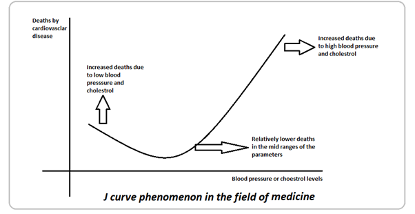
J curve phenomenon in the field of medicine
In the field of medicine, the J curve phenomenon studies the relationship between deaths caused by cardiovascular disease and blood pressure or cholesterol levels on the y axis and x-axis, respectively. When plotted, the trend line shows that those with higher blood pressure and/ or cholesterol levels have higher mortality due to cardiovascular diseases. Similarly, those with very low blood pressure and cholesterol are also prone to death from heart diseases. However, when the parameters are normal, the deaths due to cardiovascular diseases are relatively lesser.

Copyright © 2021 Kalkine Media
J curve effect in economics
The J Curve effect investigates how currency depreciation affects trade surpluses and deficits. A drop in currency value, on the surface, appears to enhance exports while decreasing imports due to the higher price to be paid.
It is, however, a more complex procedure. When a currency depreciates, the current account deteriorates first before improving. A J curve depicts the worsening and subsequent improvement, which can be described using the Marshall Lerner condition.
When a currency depreciates, there are pre-existing contracts between importers and exporters that may define trade volume. As a result, importers and exporters may not benefit from the change in the exchange rate in the short term.
Furthermore, demand is relatively inelastic since customers are accustomed to a particular purchasing pattern, and changing it takes time. As a result, the price elasticity of demand for exports and imports is relatively inelastic in the short run. As a result, the value of imported goods exceeds the value of exported goods. This explains the downward part of the J curve, where there is a deficit because the import value exceeds the export value at pre-existing consumption levels.
However, in the long run, consumers' response to price changes induced by exchange rate fluctuations gradually rises. As a result, demand becomes more price elastic. Thus, the value of exports exceeds the value of imports, resulting in a trade surplus, as explained by the upward sloping segment of the J curve.
 Please wait processing your request...